What's new
Keep up-to-date with the latest improvements to all of our Retirement Income Simulator products

Keep up-to-date with the latest improvements to all of our Retirement Income Simulator products

On 22 June the Parliament passed the Fair and Sustainable Pensions Bill, increasing the full pension asset range by up to 31% (couples) but slashing the part pension asset range by around 48% from 1 January 2017. We have included this in the 1 July release assuming the new taper rate and the present value of the new assets thresholds are applicable now. We suggest all RIS users review their retirement plans in light of these changes:
| As at 30 June 2015 | From 1 January 2017 | |
| Single home-owner asset threshold | $202,000 | $250,000 |
| Single not home-owner asset threshold | $348,500 | $450,000 |
| Couple home-owner asset threshold | $286,500 | $375,000 |
| Couple not home-owner asset threshold | $433,000 | $575,000 |
| Asset taper rate | $1.5 per fortnight for every $1000 of assets over threshold | $3 per fortnight for every $1000 of assets over threshold |
We all tend to glaze over when presented with those necessary but dense T&Cs. Well the RIS has had a front page makeover, and here is the same content but presented better. Four important things you need to know about using the RIS, but a simple icon and a brief heading gets the message across more effectively.
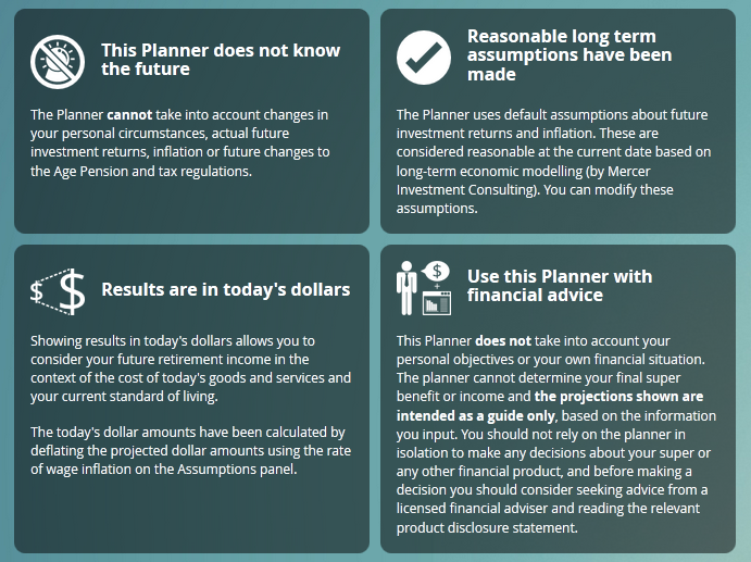
We’ve also changed the way charts get incorporated into the PDF. Previously we converted the chart to an image before putting them onto the pdf. However now we re-create the chart on the server and add it into the PDF. You can see the differences in the following two images:
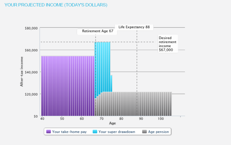 after:
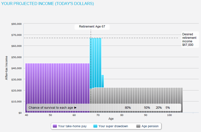
Notice how much sharper the text is - if you zoom in on the PDF text it will now be crystal clear, no matter the size.
before: after:
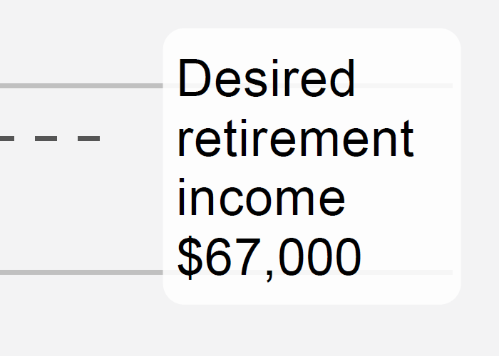 This also means that printing your PDF will give you a much better quality printout.
Tags:
retirement-planning
pdf
updates
terms-and-conditions
age-pension
government-co-contribution
The Retirement Income Simulator’s summary screen is a great way to get a high level view of your future, and today it’s received a substantial visual upgrade. We’ve gone from simple blocks of text:
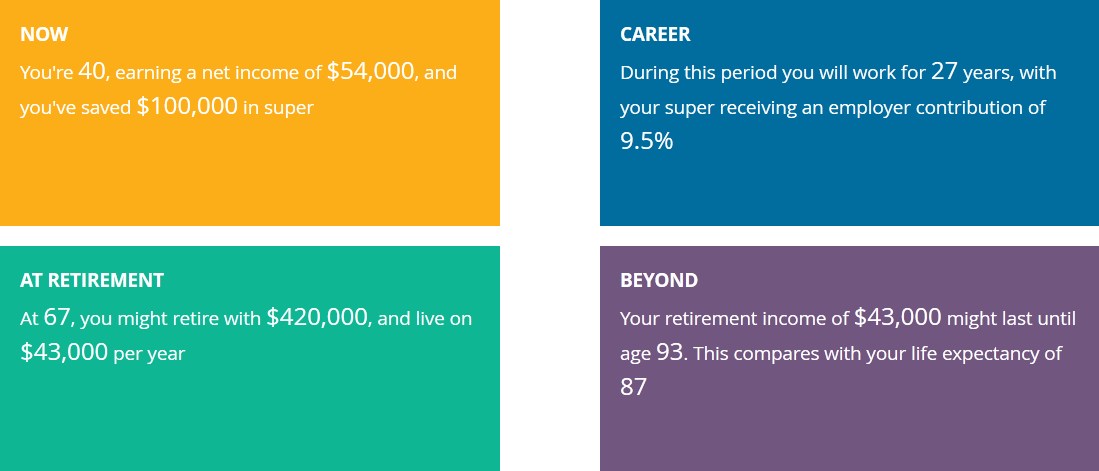
…to something a bit more visually engaging:
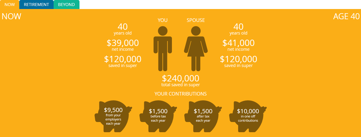
The new summary screen contains all the same information as the old screen, as well as some new features. Now you can see an estimate of the chance of outliving your super, and an explanation of how changes you’ve made using the compare scenarios feature could affect your retirement.
You can try the new summary screen in our live demo.
The user interface for the Retirement Income Simulator online calculator has been redesigned. The new interface design features a responsive layout, with custom layouts for desktop PCs, tablets, and mobile phones.
In addition to the new design, we've added two new features.
A step-by-step tutorial has been added explaining the projected retirement income graph. This tutorial explains the basic operation of the calculator, and demonstrates how altering certain inputs can affect the retirement income projection. It opens by default, but can be skipped.
For users who relate better to an infographic style presentation, the calculator now provides a simple text summary of their retirement projection with the key numbers highlighted. The summary is separated into the following time periods:
We've also updated our calculation engine with the following legislative changes:
Tags:
updates
age-pension
design